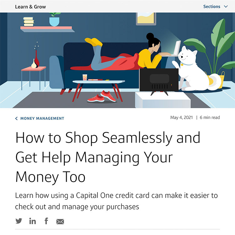
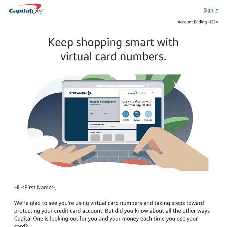
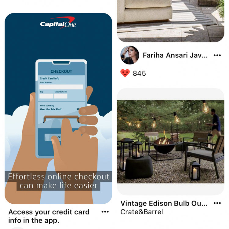
In Spring 2021, I worked on a creative team as Display Lead to launch the Spend Management campaign, showcasing some of Capital One's digital banking features. This initiative resulted in two 15-second animated Youtube ads showing colorful characters using these features to simplify their finances and make their lives easier. Additional placements rolled out across multiple channels including social media, paid banner ads, email, and the Capital One website.
Blog

Homepage
Pinterest placement
Seeking the Why
My main role was translating these animated videos into banner ads, but I was also involved as a consultant during the early stages with storyboards and scripts. Throughout the process, we focused on understanding the "why" behind each scenario. It was crucial not to force our desired message into a cute storyline that didn't service it. We also paid special attention to making our characters and their world vibrant and lively, ensuring the stories didn't feel isolating, even if our characters were depicted at home alone.
A Sprint to the Finish
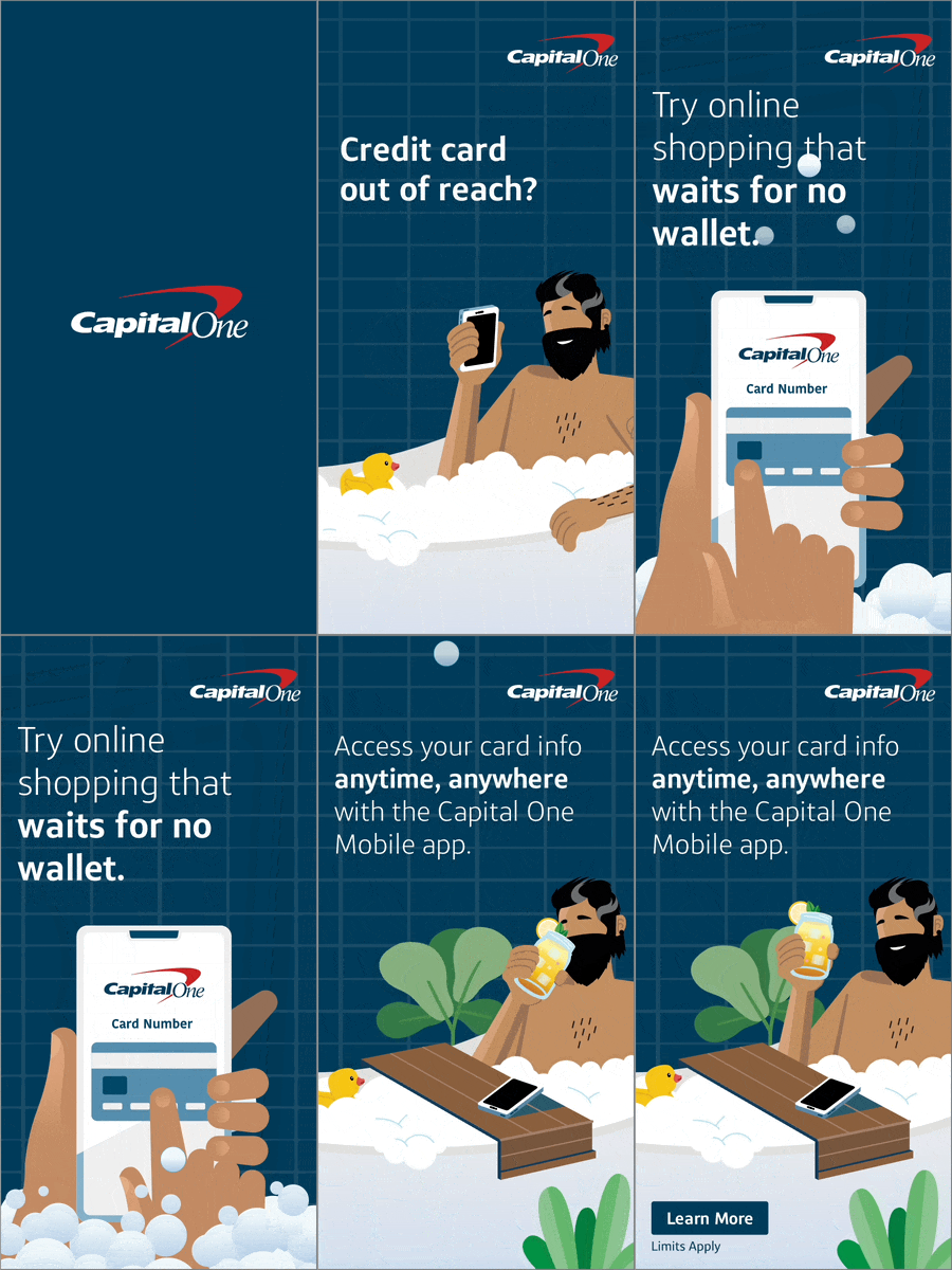
Originally, I planned to use the videos as a template for animating the banners. However, reality didn't quite match up. The display ads needed to launch simultaneously with the videos which were still being tweaked and finalized. To make matters more challenging, the assets I needed arrived a few days late. When it was finally my turn to bat, all I had to work with was multiple storyboards and scripts that were nearly finished but still subject to change. I had to make educated guesses, translating the stories and movements as accurately as possible into the display ads while anticipating how they would align with the final videos.

160 x 600
300 x 600

300 x 250

320 x 50

728 x 90
My Work on Display
The end result? I designed over 15 banner ads and scripted animations for the entire batch in under 2 weeks. The display portion of the campaign seamlessly complemented the videos and the rest of the campaign. Though I faced a time crunch working on these banners was very rewarding—not to mention adorable!

160 x 600
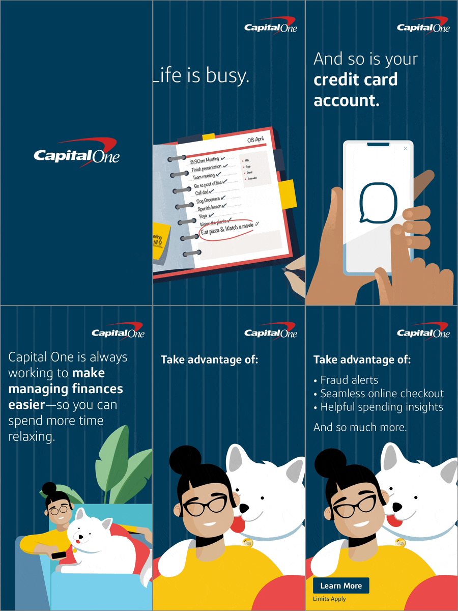
300 x 600

300 x 250

320 x 50
